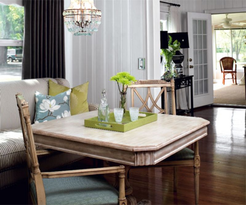
With a family of four to feed and only a small space in which to do it, Heather and Brady Marz were desperate for a dining room redo. Not that they had to look far for how-to help; Heather is an interior designer, and together the pair owns home decor shop The Sitting Room. “The trouble with this room is that we have to walk through it to get from living room to kitchen,” says Heather. “That means we can’t have large furniture blocking the passageway.” The pieces they’d “made do” with since moving in were small alright—too small to seat the entire family, much less guests. “When friends come over, we often congregate here while the kids play in the family room,” she says. “So the space needed to be comfortable.” By pairing furniture they had with new pieces sized to fit, they made it just that, adding enough color and shine to grant the room a personality all its own. Because of its position between living room and kitchen, the dining area is constantly used as a thruway; and the owners’ former furniture was overly small as they considered how to make the best use of space. The open floor plan calls for decor to coordinate, yet be distinct from, neighboring spaces. Beige wall paint didn’t provide the crisp look the pair favors, causing furnishings to “fall flat.” 1. Create Storage Space: A chest pulled from the master bedroom fits snugly against the wall near the kitchen. With a silver metallic finish, it “adds shine and makes the space feel less serious,” says Heather. Dressed with sleek accessories, it can be cleared off when company’s coming and used as a serving station; plus, the drawers give Heather a place to store her table linens. 2. Bring On the Glam: The blue crystal chandelier is glitzy enough to dress up the space yet neutral enough to go with Heather’s ever-changing room accessories. “We moved the light fixture so that it is centered over the furniture rather than the middle of the room; this helps define the dining area,” says Heather. 3. Add Accent Colors: Paired with a chartreuse serving tray, agate coasters bring in a pretty punch of blue—a color that Heather pulled from a table just through the living room doorway. “To achieve a nice flow between rooms, I often choose an accent color from one space and play it up in the next one. I’ll pick a hue that’s a few shades lighter or darker so it doesn’t feel contrived.” All colors pop against the crisp white paint Heather chose for the wood paneling. 4. Dress Up What You Have: The settee, covered in a cotton ticking, is a piece of furniture the Marzs had in their previous home in California. “At first, we thought it looked a little too ‘country’ for this house, but the size was just right for the space, so we added some colorful pillows to make it look more modern,” says Heather. Paired with grey velvet curtains, the settee creates the lounge-like atmosphere Heather was seeking. 5. & 6. Mix Casual & Elegant: Wanting the room to be dressy but not formal, Heather chose a table and chairs with elegant lines and then toned them down with more relaxed finishes (“parchment” on the chairs and “driftwood” on the table). Likewise, accessories are finely crafted without being flashy or fussy. Budget Snapshot A look at the designer’s key investments: • Paint: $30 • Pedestal table: $1,740 • Dining chairs (two): $995 each • Chandelier: $1,195 • Curtains (four): $30 per panel • Curtain rod: $15 • Throw pillows (two): $125 each Where they shopped: • Lowe’s, Target, and The Sitting Room