


When Shelley and Marcelo Hochman first laid eyes on their Gibbes Street home, they didn’t see a plan. There were no mental sketches of amped-up natural light via wide-open rooms or Mid-Century curves contrasting clean, contemporary cabinetry. They simply saw a good-looking house to rent. Married a year earlier, the pair figured it was big enough for their then-blossoming family (Shelley was pregnant with their son, Jacob; sons Joseph and Adam were in school in Texas); it would do fine while they sorted out the particulars of what’s next.
But some of the smartest designs happen that way. Organically, that is—with an open mind, pops of ideas here and there, and healthy doses of both patience and restraint.
“We didn’t really know what we wanted,” Shelley admits. They’d been living in a smallish condo in Mount Pleasant before their search for a more family-oriented set-up landed them here—a 1980s brick number South of Broad. “It was dated,” recalls
Marcelo. “Nothing had been changed since it was built in ’86, but it worked. The neighborhood was ideal, and the house had a good, contemporary backdrop that I liked.”
So much so that when, a year later, the owners indicated they’d like to sell, the Hochmans snapped it up. “We knew we’d have to make changes, but we wanted to live here a while first to figure out what did and didn’t work for our family,” says Shelley.
Five years later, when it came time to flesh out a renovation plan, they made several smart moves, starting with tracking down the home’s architect, Robert Epps. “It was a great house from the beginning,” Marcelo says, “so we figured, why not go to the source? Besides, how often do you get to work with a house’s original architect in Charleston?”
Epps signed on, and as they began relaying their wants to him—additional natural light, a more open layout, and more efficient use of the space upstairs—and began solidifying a plan, they did so without a timeline (smart move number two). “We had only so much to work with financially, so we thought through everything up front—changes are what drive up the cost,” says Marcelo. “We wanted to get it right before the work started.”
Finally, they didn’t turn the house on end (smart move number three). “This wasn’t about making it into something it’s not,” says Marcelo, noting that save a laundry room they repurposed to function as a sitting room off the kitchen, they left the downstairs rooms right where they were. “We liked this house to begin with. We just refined the details.”
Details are, after all, his specialty. A noted facial plastic surgeon, he admittedly
immerses himself in the finer points, the puzzle pieces that comprise the bigger picture. Shelley laughs and shakes her head as he marvels at a pair of small, 1940s bookends in the living room, explaining that they were modeled after the Trylon and Perisphere (the spire- and sphere--shaped buildings that made headlines at the 1939 World’s Fair in New York). He laughs too, and adds, “It’s the form of things, the details, that I love.”
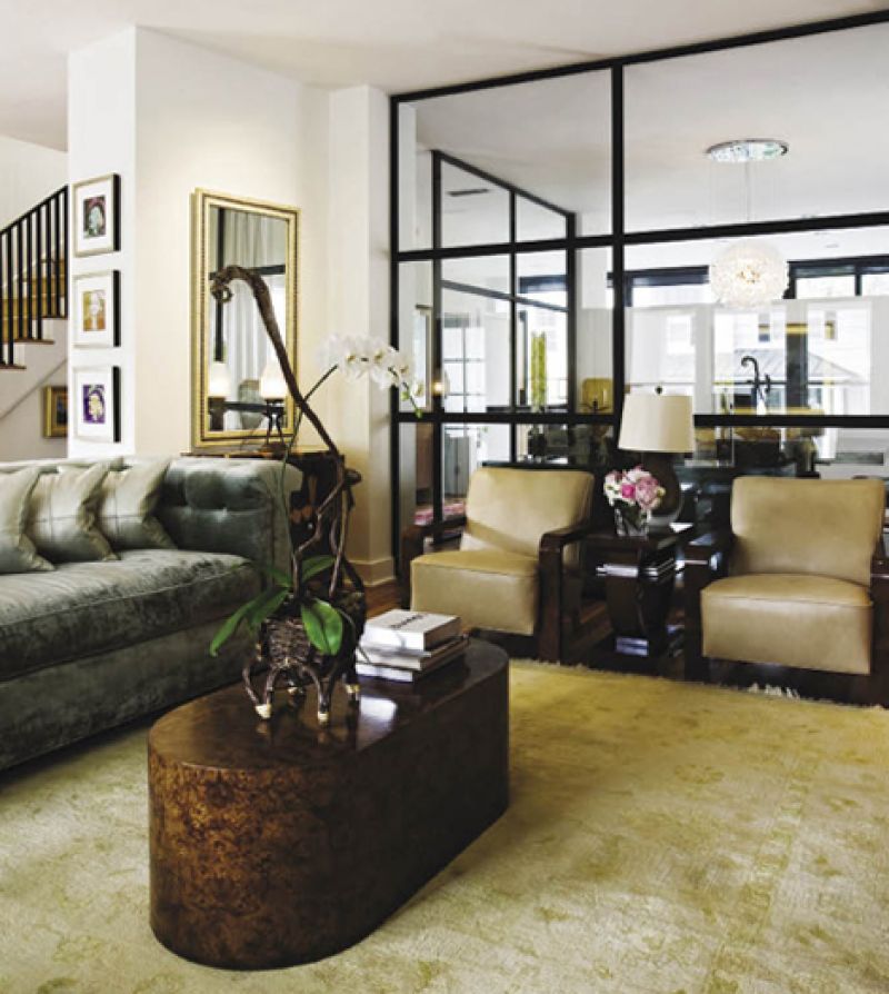
And so, Marcelo worked with Epps to employ simple, modish tricks to freshen up (and open up) rooms throughout the house. For instance, the back-to-back living/dining/kitchen set-up gave the downstairs rooms an isolated, hushed formality, so Epps removed two walls in the middle space, the dining room, to encase it in floor-to-ceiling, steel-paned glass. And by adding an additional glass wall along the back of the house (framing the kitchen), removing transoms, and lowering an existing kitchen/dining wall to allow a four-foot gap between it and the ceiling, they fed additional light to the entire floor.
Throughout, Epps designed streamlined cherry cabinetry fitted with frosted glass, including a pair flanking the fireplace; one serving as a smart, space-saving bar in the hall; and more wrapping the kitchen, which was one of the few spaces treated to a total overhaul. Along with replacing cabinetry, they added a sizeable granite and cherry island and gleaming marble flooring. Plus, the new glass wall overlooks a tidy bluestone terrace below, bordered by a mix of elephant ears, Italian
cypress, hydrangeas, ornamental grasses, and holly and punctuated by a smart island fire pit that doubles as a coffee table, designed by Marcelo himself. “Before, the back garden space was overgrown and mosquito-ridden, like a jungle. We couldn’t use it, much less want to look down on it everyday,” says Shelley. “But now we’re back there all the time.”
Upstairs, Epps and the Hochmans went for more cherry detailing, this time in the form of sleek paneling that wraps the hall (think retro idea gone super chic). Beyond that, changes to the second floor were aimed at simply making the space they had work a little harder: by downsizing a TV room, for example, they made way for a roomy walk-in closet (also wrapped in cherry) and by simplifying old his-and-her bathroom suites to form a single, no-fuss bath, the couple was able to tuck a just-right office space for Marcelo into a nook in the hall.
When it came to furnishing the newly revamped abode, Shelley and Marcelo looked first to the treasures they already had. With the help of interior designer Juan Tamarit, the pair sorted through their art collection (including paintings by Santa Fe artist Jean Claude Gaugey and South Carolina’s Craig Crawford and McLean Sheperd), a colorful compilation of Catteau pottery, and numerous other gems Marcelo had acquired from 20th-century furniture expert Dick Dailey, such as a marble top 1930s dresser with macassar
veneer and a pair of French Art Deco chairs. “Juan looked at what we had and said, ‘This is your starting point,’” recalls Marcelo. “That was important—we wanted what we already loved to form the foundation.”
Only then did they begin to fill in what was missing, adding a Sputnik lamp here, a
Nakashima side table there. The real showstoppers? Commissioned pieces—some designed by Tamarit—like an updated take on a Chester sofa covered in an icy gray silk velvet, custom hand-silvered mirrors by Charleston Architectural Glass, and a dynamite square dining table built by local furniture maker Neil Butler and finished in an edgy metallic foil glaze by decorative painter Suzanne Allen of Wall Candy (she also wrapped the powder room walls in a swank faux alligator-skin finish).
Throughout, Shelley worked with Tamarit to “soften things up,” as she puts it. “Marcelo could go super modern, but I’m about feel and function,” she notes. So they incorporated rich textures—like the headboard in the master bedroom upholstered in watered silk velvet—and “softening” elements like a snowy shag rug and simple linen draperies.
“To me, all of this works together,” Shelley says, pausing while her husband revels in the artful silhouettes of a pair of prized Frank Lloyd Wright-designed planters framing the back door. “The form of these elements is what makes him feel good. For me, it’s the bigger picture—a pair of aqua-colored lamps that we bought together, an antique mirrored chest given to us as a gift when Jacob was born. That’s what makes it home.”
Marcelo agrees. “The starting point for this house was us. We took our time, worked with what we had, and benefited from the talents of a number of people along the way. The result is as much a reflection of ‘us’ as how we started—that’s why it works.”