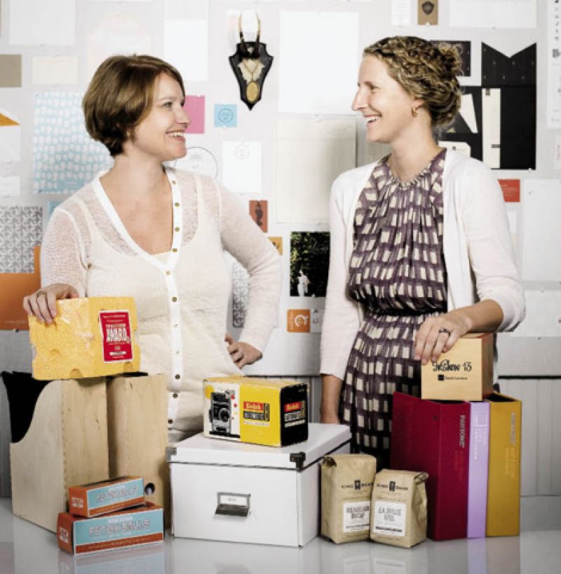
For graphic designers Courtney Rowson and Amy Pastre, effective branding is all about the materials. From the Library, Archives of Fashion vintage clothing company’s award-winning athenaeum-inspired identity package (complete with logo, business cards, library card-receipts, stationery, website, and blog and e-mail templates) to retro-style tins of Therapy Dog Treats for Harry Barker, the founders of Stitch, A Design Co. have crafted an original aesthetic that balances simplicity, modernity, wit, and an appreciation for tactile experiences.
On a glass table at their No. 9 Cannon Street studio, Rowson and Pastre assemble made-to-order identity solutions from scratch. “Branding should be smart, thoughtful, and beautiful,” says Pastre. Be it the weight of the paper or the ease of navigation on a website, the user experience of the product is always foremost on their minds.
Indeed, the partners’ shared focus on the tactile can be traced back to their original endeavor, a letterpress company. As the story goes, the design partners met in 2004 when Rowson, who was freelancing after working in San Francisco, and Pastre, who was working for a local advertising agency, teamed up for a small project. After discovering many common threads—design, family, even spinning—they decided to pursue a creative whim and purchased a vintage letterpress. With partner Virginia Gregg, they formed a side venture, which they aptly dubbed “Sideshow Press.” What started as a hobby quickly evolved into a sought-after stationery business. Five years later, they united their symbiotic visions on a much bigger scale, launching Stitch, a full-service boutique branding and design firm.
Vintage paper and textiles stimulate these unconventional tailors as they seam together evocative details of their clients’ business models and philosophies into a comprehensive brand. “We give them a suitcase of what they need,” says Pastre, including a family of logos, color palettes, and branding exercises. “Amy and I work on everything together,” Rowson adds. “And we’re as collaborative with our clients as we are with each other.”
That level of collaboration and customization requires the graphic designers to constantly be on the hunt for unique materials—whether paper, wood, cork, fabric, or flocking. “We pull inspiration from fashion designers, vintage books, food, interiors, travel—there is so much out there to be inspired by and we find it wherever we go,” says Rowson.
Each creative decision the team makes reflects the core message of their specific client. Whether it’s signage for Hominy Grill; a handwritten logo designed for the Lee Bros.’ new line of kitchenware; or a full identity package, marketing materials, and website for event designer Tara Guérard Soirée, every concept is as unique as the diverse clients to whom they cater.
Case in point: the lofty challenge of rebranding a 65-year-old company. “Schermer Pecans is a fifth-generation family business, but their products didn’t convey that,” says Pastre. “We thought each pack of pecans should be a gift because you’re buying more than just a nut, you’re buying a family’s tradition.”
After touring the Glennville, Georgia, facility and reviewing decades-old images, they developed the new packaging of cloth bags silk-screened in etched open-type font—a retro design that encompasses the business’ past and present and will take them, in any flavor—glazed, salted, or caramelized—into the future. For Stitch, that equals another happy customer—a seamless success.