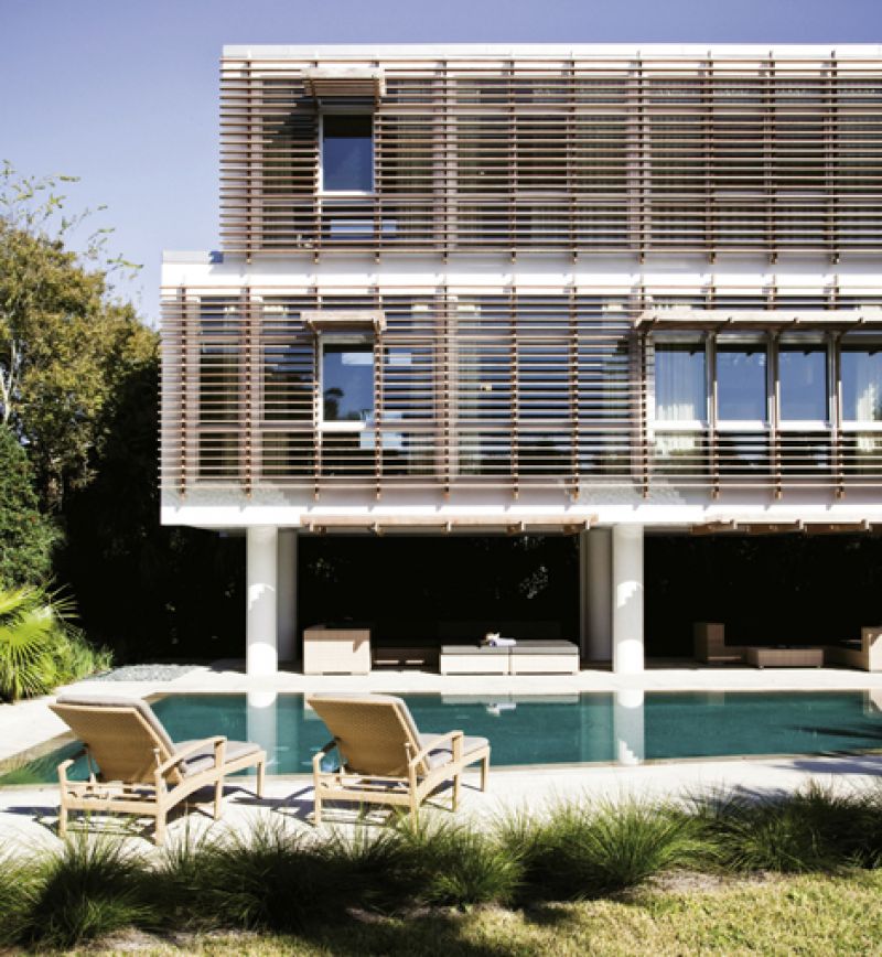
“I’m a big believer in contemporary architecture being attuned to place,” says New York-based architect Stephen Yablon. “And while modernism is a great form of expression, you can’t ignore what’s special about the location where a structure exists.”
It was with that “location leads form and function” edict in mind that Charleston-born Yablon designed a bold poolside guest addition for a childhood friend on Sullivan’s Island. “We’d just completed a renovation of the family’s beach house,” he says of his London-based clients and their breezy, 2,600-square-foot vacation home on the property. “It’s a summer house for them now, but as their children get older, they plan on spending more time in the States; they wanted more room to entertain, plus an office and guest quarters.”
A key design point was a 66-foot-long trapezoidal lap pool that runs perpendicular to the rear of the home. Yablon configured the new 1,600 square-foot addition in a “railroad car shape” as a contemporary take on the Charleston single house and oriented it to serve as a backdrop for the pool. “The addition is a long, skinny box,” he explains. “It’s one-room wide with cross ventilation and a narrow lot off to the side.”
Counterbalancing the slim interior with a feeling of airiness is a floor-to-ceiling glass wall. “Because the structure faces southwest, we wrapped it in ipé slats to create a modern sunscreen,” says Yablon, who finished the underside of the structure with local cypress ceiling panels and steel beams to create a shaded pavilion.
In terms of creating interior livability, “this was like designing a boat,” he adds. “There’s no basement or other hidden space to put all the unsightly mechanicals and run plumbing lines. So it takes a fair amount of planning to fit all that into the form of a narrow floating box.”
Yablon and his team ran ductwork underneath built-in seating on the first floor, routed plumbing lines through one of the home’s supporting columns, tucked the HVAC unit into an upstairs closet, and designed a kitchen that could host—and hide—a slew of utilities. Even the desk in the office sports hollow legs that funnel computer and electrical cords.
The result is a thoroughly modern update to traditional design with a streamlined interior of white walls, glass windows, and wooden floors that create a bare canvas for shadows and sun splashes to play. “It’s a pretty little light box,” says Yablon.
Cross Ventilation: All windows were designed with operable panels that open for cross ventilation. The rear wall is punctuated with strategically placed “punch” and clerestory windows that allow glimpses of the vegetation and beach, but not the neighbors.
Plenty of Privacy: Tall, neutral draperies and rolling linen shades afford the owners privacy behind
the glass wall and other windows.
Tempered Sunlight: The slatted ipé wall features overhangs to allow shaded, but unobstructed views.
Space-Saving Built-Ins: Fixed sofas, shelves, and cabinetry were constructed as part of the interior
architecture to save room and streamline living quarters.
Sliding Doors: Pocket doors tuck into walls and don’t take up space like hinged entries.
Weather Resistance: All metals used on the exterior and underside of the home were galvanized, then powder-coated to prevent rust.
Steel Framing: Metal framing allowed the interior to be free of load-bearing beams, which would have cluttered the spaces, and permitted a higher ceiling height than traditional framing.