Melissa Ervin’s clients knew what they wanted when they grew up. The couple had lived downtown for a couple of decades, content in an historic two-story South of Broad. They traveled plenty—from Miami to Instanbul—and every summer, carved out a stretch to spend down the road in a rental on Sullivan’s Island. It was a salty respite they hoped would reinvigorate them for the year ahead, just until it was time to hit marsh and sea all over again.
Then, sometime in their early-50s, they figured, why wait until next year, and then the next? “It was like a rebirth, the start of a new chapter in their lives,” recalls Melissa, better known as “Missi.” The couple—both College of Charleston grads—left the beach rental market and waited for the right house to come along. When it did—a gem of a listing along Sullivan’s marshy northwest face—they leapt.
Well, sort of. They called their longtime friend Missi for a second opinion, and then they leapt. “I remember walking through that wide-open floor plan and thinking, ‘Wow, they’ve been living downtown in a traditional side-hall Charleston single—where each room is separated from the next—for so long, this openness is really going to be a refreshing change,” she recalls.
It was a new house, barely completed before it was listed. Kitchen tiles and countertops were in, bathroom fixtures set, but in one respect, this “second chapter” (as Missi calls it) was something of a square-one start. They kept their downtown house, so with the exception of a few heirloom pieces (i.e., Rosewood dining chairs said to have
belonged to General Sherman and a 19th-century mahogany daybed), their furnishings didn’t move to the beach with them.
Besides, adds Missi, “their downtown decor was very traditional and here, they were ready for a more relaxed and modern feel.” Translation: at the beach, natural woods and ironwork rule; white slipcovers and neutral upholstery are in, heavy hues out; and the rest? You fill in as you go.
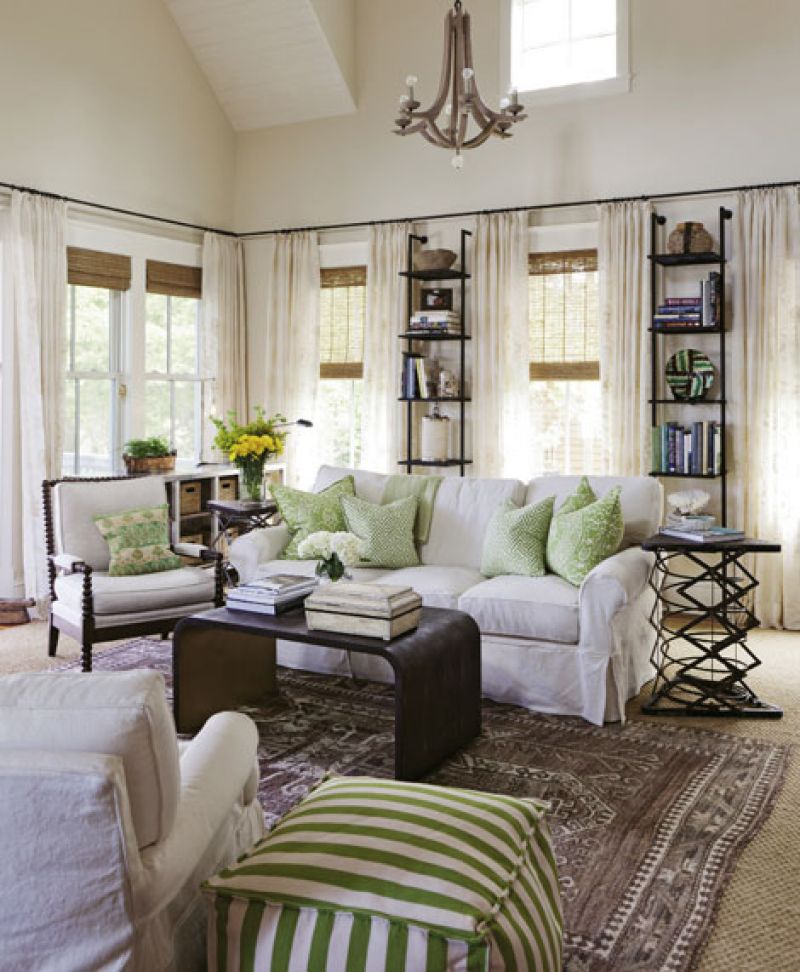
“We took traditional and simplified it,” says Missi. White cotton slipcovers mix with interesting wood frames—the curvy bamboo patio set on the porch, for example, is groovy 1960s vintage—while other foundational pieces, like a large metal cabinet from the West Indies and a pair of sculpted iron end tables, ground the rooms in a rustic outdoorsy vibe. “A really striking aspect of this house is the light,” says Missi, pointing to a U-shaped bank of windows in the living room. “They have all these wonderful views out to the marsh, so it was important to maintain that focus, rather than distract from it with what we brought inside.” Hence, hand-woven Ralph Lauren sheers frame the windows downstairs; upstairs, it’s simple indigo panels in a guest room, green and white hand-blocked draperies in the office.
The same principle applied in filling in a pair of narrow strips of wall between windows in the living room. “They wanted a pair of bookshelves there and found a photo of slim chrome towers that might do the trick,” says Missi. She streamlined the idea and commissioned ironsmith Rick Avrett to craft a pair of slender iron built-ins that give depth to the space without overtaking it.
But even the most uncomplicated of beach houses need zing—that “third layer” shine ushered in one piece at a time. “I think it’s important for a house to tell a story—that no matter who the designer is or how big his or her role, the details tell you about who really lives there,” says Missi. “Here, my clients’ travels are reflected in every room.” For instance, a trip to Turkey netted a pair of rich Suzani pillows, various swings through New York is how they came upon a pair of colorful silk Niba rugs and a large-format black-and-white photo by Vogue and Vanity Fair veteran lensman Greg Lotus, and the abstract artwork in the game room—titled The Smooch by Jefro—was bought at auction. Close to home, they found a mod rhinoceros sculpture by Pawley’s Island artist Terry Brennan at the Michael Mitchell Gallery on King Street.
“These pieces add character and depth,” says Missi of the couple’s “domestic rebirth.” “And that’s very important. My clients reached a point in their lives where they can enjoy the slower pace of Sullivan’s, but they made sure the new house still reflected their history. The mix of these hunt-and-find treasures and family heirlooms really weaves their story together.”
STEAL THIS LOOK
Designer Melissa Ervin breaks down the basics of keeping traditional decor eclectic and interesting
Behold the Power of Neutral
“We used a mix of off-white duck cloth, textured linen, and canvas Sunbrella for our foundation fabrics. My clients love green, so we used that as a starting point for pillow and slipcover patterns and pulled in vintage quilts to add a layer of warmth.“
Mix Up Your Rugs
“Sisal and seagrass rugs layer well with older rugs on top. I tend to go for muted rugs in soft colors—tone on tone—in main rooms, and use stronger color or pattern in smaller spaces, like an entry or hall where it can really sing and not compete with other elements.“
Listen to Your Instincts
“I like to shop with my gut—a totally open mind. I browse antiques stores and take pictures of everything I love, then ponder all of it. Most shops will let you take items out on approval, which I recommend to confirm that it will work the way you think it will.“
Simplify Where You Can
For instance, the living room has nine windows. “Nine separate curtain rods would just clutter the space,“ says Missi. As a workaround, she ordered one long, custom rod to wrap three sides of the room, “which really streamlines the elements and unifies the space.”